Did you know that since 2015 Google has penalized non-responsive pages? Indeed, if your site cannot adapt to tablets and other mobile devices, your content will not appear among the first results of search engines. And this is not the only effect that carelessness in design can have on web positioning. Let’s see how the two are intimately related.
Design and web positioning in mobile-friendly sites: Responsive SEO
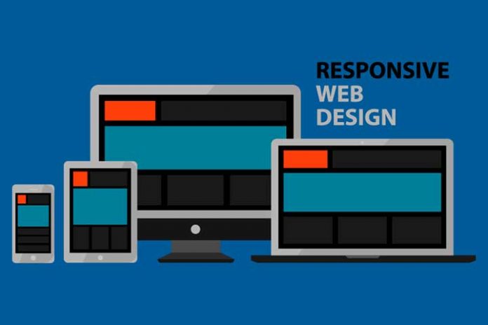
Adaptive or responsive web design allows a website to be usable and accessible from mobile devices, such as tablets, smartphones, and desktop computers. This feature influences the user, who does not tolerate load times greater than 3 seconds and does not give second chances in case of poor UX. As a consequence, the web positioning strategy suffers. Let’s see why.
Google favours sites with a mobile focus
We said it in the introduction to this article, and it makes perfect sense that it be so. Each modification of the search engine algorithm aims to make life easier for users. Consequently, it penalizes those pages with a low permanence rate or a high bounce rate. And these two parameters are the first to suffer when the page’s design is not adaptive. That is why it is necessary to consider, from the beginning of a website, that design and web positioning go hand in hand.
A single design for all devices
When we talk about web design and positioning, we must mention the comfort of a single page. Responsive websites do not need multiple URLs with these benefits.
- Redirects are avoided.
- The immediate consequence is that the loading speed is not increased (often weighed down precisely by the redirection).
- The web architecture is more straightforward and, therefore, easier to maintain and administer, saving either internal human resources or outsourcing the service.
Also Read: Custom Web Pages Or Pre-Designed Templates?
Duplicate content is avoided
Google rewards originality. Companies that maintain two different web pages, one optimized for desktop computers and the other for mobile devices, find it necessary to duplicate their content. Of course, this duplicity negatively affects positioning and is a real burden when designing an effective SEO strategy. When two different URLs are hosting the same content, Google doesn’t know which one to give preference to, which tends to work to the disadvantage of both.
The responsive design avoids that problem. By having a single web page capable of adapting to all types of devices, the content will be displayed on all of them equally.
Resource savings
Savings are produced when the same web page is optimized for use on mobile devices. The reason is that you don’t need to double the number of domains.
There is no need to duplicate resources to make your website responsive. The domain is the same, the storage is the same, and your display content will not change either. You need a professional to make sure your site design is responsive. This investment may be higher initially, but cost reductions in the medium and long term offset it.
More efficient updates
When a website is responsive, updates to it are made easy. It is no longer necessary to act on different pages. This is a direct consequence of the unique URL we discussed above.
Usability is improved, and a better customer experience is offered
Page design and SEO web positioning feed each other when the first one improves usability. Responsive design ensures that the mobile user experience is better. As a consequence, Google will reward you with better rankings.
By improving usability and UX, the responsive design improves positioning in Google.
Google’s main concern is that its users are satisfied with its services. For this reason, it recommends pages whose statistics point to greater visitor satisfaction. You should know that the user experience is one of the indicators that Google uses to determine the degree of satisfaction.
Lower bounce rate
Bounce rate measures the number of times users come to your site and leave without action. In other words, it is an indicator of the level of satisfaction that those users get from your site.
One of the reasons the bounce rate goes up is because the page doesn’t load fast enough, or the user experience it provides isn’t good enough. One of the consequences of a high bounce rate is a drop in Google rankings.
Responsive design helps improve the bounce rate because it decreases loading time and improves the user experience.
Also Read: 5 Tricks To Optimize Your Website And Position Better
Popularity is increasing
One of the reasons companies have websites and the irrefutable fact that we are immersed in a global process of digital transformation is to improve communication with users. This communication is carried out, in large part, through social networks. And the latter is accessed, above all, by mobile.
Web design and positioning go hand in hand again in this context. When your users can interact with you without incident, your brand’s reputation increases, affecting the SERPs again.
As you can see, when we talk about web design and positioning, we cannot restrict the speech to two or three advantages. Both concepts are intimately linked, and without the first, the second suffers. A responsive web design is indeed more complex.


